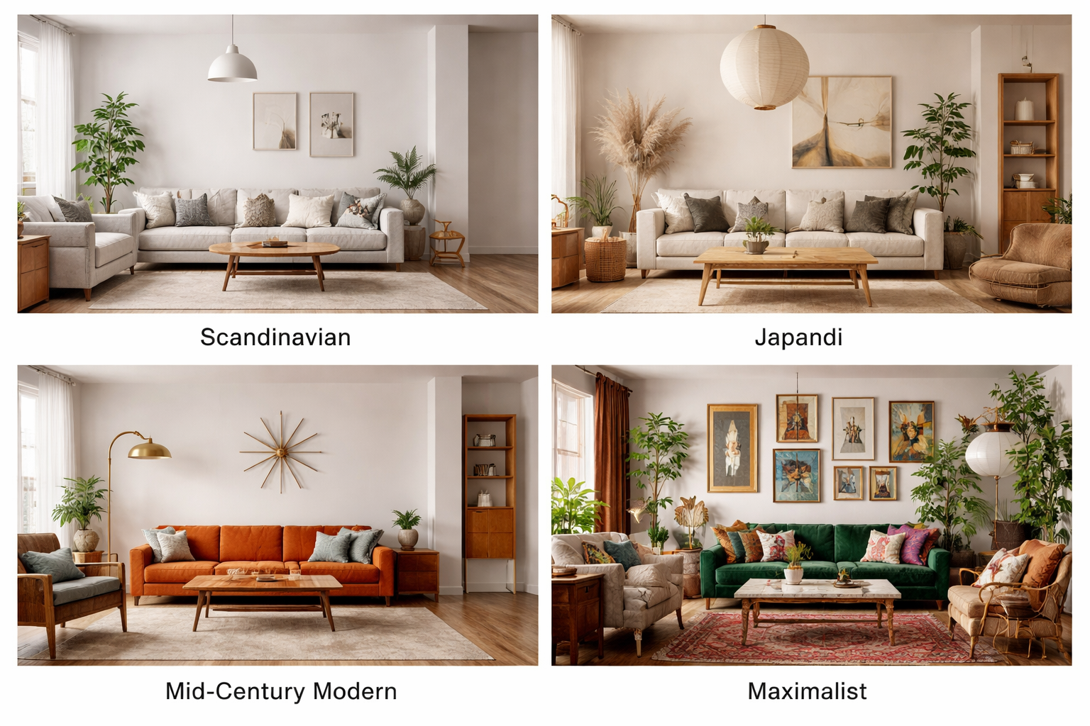
Choosing Colors
Choosing your paint colors is probably the hardest decorating decision you will make. Don’t be daunted: allow time to experiment. Consider your colors as you would a love affair. Much as you enjoy their company, would you want to live with them?
Color confidence
Given that choosing colors is so much a question of personal taste, why not start with the ones that attract you most? Remember, though, that color is not static, the same shade can look quite different in daylight or under artificial light, in matte or gloss finish, or used on a cupboard or on walls. Also, a color becomes hugely intensified over a large area.

Imagining the order of the colors in a rainbow spectrum can help with combining colors. The three primaries –red, blue, and yellow- are intersected by the secondaries – violet, orange, and green – each color shading into its neighbor. Between them are tertiaries: turquoise, mixing blue and green, for instance. Warm colors – yellow, orange, red – are known as “advancing” colors, while cool blues, grays, dark greens, purple are “retreating.” some colors, known as “complementary” colors, produce a neutral shade and balance each other when mixed equally together.
Brights
Brilliant, sizzling color – cheerful, extrovert, exuberant – gives a real boost to the spirits. Think of a field of red poppies, or golden sunflowers turning to face the sun. many people find a dash of bright color in details like cushions, flower, or ceramics is enough to lift the quieter base colors they choose for their surroundings.
More confident temperaments use hot, attention-seeking reds and yellows as their main theme. The more intense a color, the greater its purity, and the less gray it contains. Remember that flat, opaque color can be inert and hard; broken by texture and pattern, however, it becomes atmospheric and alive.


Pastels
Lighter shades of a color brighten dark rooms and are softer on the eye than fully saturated color. The paler tints of pink, violet, pale blues, and greens are gentle and restful to live with; they are generally seen as “feminine” colors and are often used in bedrooms, teamed with lace or voile curtains and muslin drapes. Brighter sherbet shades work especially well together, combining different hues of similar strength, and are popular with modern designers who use them in solid, matte finishes for a fresh, clean look. 
Delicate washes of pastel shades, especially pearly gray, blue, and cream, are a hallmark of Swedish style. A thin, cool color can be enriched by a layer of glaze or watercolor in a softer, deeper shade, which lends itself to a country-style setting.
Earthy Tones
Ocher, sienna, umber, terra-cotta, the brownish reds are the earth colors. The first colors used by man, the natural pigments are clays, although today most pigment is chemically made. These handsome rusty, spicy hues look superb in Italian frescoes and house exteriors under hot sun. Transferred to the walls of a contemporary building, they can look muddy, unless used with the right furniture and finishes. They are superb teamed with olive or dusty blue-gray woodwork; a splash of peacock blue can look stunning against an umber ground.

Earthy colors respond especially well to rough surfaces and distressing and colorwash treatments, which break their flatness and bring them to life. A sophisticated contemporary look contrasts rough, rustic plaster walls with highly polished aluminum or chrome fixture and furniture.
Understated Shades
When color is removed from a room, the eye is drawn instead to texture and shape. Light becomes especially important, since it highlights surfaces and shadows. Think of shades of oatmeal, sand, stone, ivory, cream, biscuit, oyster; of place timber floors, driftwood, unbleached fabrics, and white china – all ingredients of this restrained, modern look. Architects love the discreet charm of neutrals and naturals, whose lightness and warmth enhance a display of well chosen furniture or an art collection.

Blues
Blue, the color of the sky and sea, is strongly associated with peace and harmony, and loved the world over for its calming influence. The range of shades is enormous, from the palest baby blue to deepest midnight. In between there are cool Scandinavian powder and pearly blues; fresh duck egg and turquoise; faded denim; the smoky blue that was favored by the Shakers; clear bright azure, seen on shutters and doors all around the Mediterranean; pure lapis lazuli and deep, rich indigo; and dark Prussian, navy, and royal blue.
Blue is highly dependent on light: for instance, the magnificent deep blues used in Moorish design under strong sunshine can look strident in thin northern daylight. It also varies with the colors put with it, becoming warmer with red, cooler with green. Blue and yellow, both primary colors, are an especially happy combination of contrasting hues, in which yellow adds warmth and vitality to blue’s coolness.
Reds
The strongest color in the spectrum, red, is the color of fire and warning, and is children’s top favorite for its in-your-face, traffic-stopping appeal. Used in decorating, red has great dramatic impact. It can also be unexpectedly romantic as it shades away from color-saturated crimson, scarlet, and poppy: think of deep red roses and romantic pinks, of warm orange and brown-tinged coral, brick and russet, and the dark jewel-like shades of ruby, mulberry, and wine. Exotic, spicy Indian reds, terra-cotta, and pinkish fuchsia and magenta are easier to incorporate into a color scheme, being less dominant than the primary reds, although these can be used to spectacular effect with the right combination of partner colors. 
The Victorian British popularized the red dining room as a rich, intimate atmosphere for entertaining. A single wall painted in the glowing, polished red of Chinese lacquer work adds vibrancy to a geometric interior. Gilt accessories look especially rich against a red wall.
Yellow
One of the most popular colors on the decorator’s palette, yellow is also the most difficult to get right. Given its affinity with the sun and summer, it is surprising how cold or muddy a tint can become over a large area, so it is well worth trying out paints and textiles before leaping to a decision. Remember too that yellow is very responsive to lighting and paint effects; it likes texture and usually looks better applied to walls than furniture. One of the three primary colors, its spectrum includes acid yellow; bright buttercup and sunflower; earthy ocher, mustard, turmeric, saffron; gold; and orangey apricots.
Creamy yellow walls with dusty blue paintwork is a traditional combination in the Shaker look. English country house style favors warm buttery yellows for the kitchen, hallway, or living room, while a sophisticated contemporary look partners pale primrose with gray. The muddier ochers are a marvelous foil for cobalt blue or Indian red.
The wonderful variety of greens in foliage has given us the names for many different shades: sage, moss, grass, fern apple, mint…..Its associations with nature, with forests and gardens, make it a quiet, contemplative color, easy to live with and combine with others. Green is a secondary color, made by mixing blue and yellow, and its character depends on which of the two is stronger. A popular contemporary kitchen color is a mid-blue-green which blends the two colors in equal strengths.
Deep greens have strong masculine connotations, emphasized by names such as racing, hunting, and bottle green; these and forest or Brunswick green are traditionally used for front doors and wooden clapboard exteriors, and inside for studies and halls. Teamed with tartans and Regency stripes, they create a comfortable, clubby atmosphere.

Mid-greens are predominant in chintzes, evocative of summer country gardens. Soft gray-green and pale mint green are much-loved ingredients in country house style. Acid green is a favourite contemporary color, and is combined with orange, metallic blue, or mauve for a sharp, modern look.
Contrasting Colors
Getting bright colors to “sing” together demands strong nerves and patient experimenting. the results can be hugely rewarding, bringing a charge of energy to your living space. Great artists like Matisse and Bonnard were masters of color, and their work is full of inspiration. Successful combinations often juxtapose colors of equal brightness or tone. The competing colors of flowers in a garden are a good place to start: brilliant vermilion and magenta geraniums with bright green leaves, sapphire blue delphiniums and orange marigolds all hold their own and balance each other.

Red and green are complementary colors, at far ends of the spectrum, work especially strongly together. Remember too that dark colors retreat and light ones advance when you look at them: a shocking pink cushion on a royal blue sofa draws your attention to the pink, and makes the sofa appear to recede.